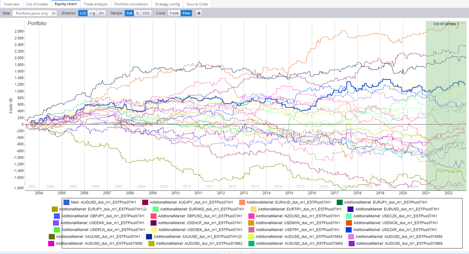
Too many colors, need help identifying symbols to lines. glow the lines on hover of symbol
It would be nice if I could hover over one of the lines and the appropriate symbol in the legend would glow. Also, vice versa, if I hover over a legend symbol the corresponding line on the chart could glow.

-
Votes +5
-
Project StrategyQuant X
-
Type Feature
-
Status New
-
Priority Normal
History
b
b
AA
AA
CG
CG
Chris G
01.11.2022 20:09
Yeah, been through this too many times. I would add if the palette of colors could degrade from the lighest color to the most darkest color, ranking from the highest Net Profit to the lowest Net Profit.
That could be easy to read.
That could be easy to read.
b
bentra
01.11.2022 20:38
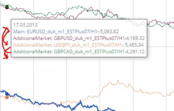
The popup would be helpful if it was ordered by the current highlighted locations' net profit so the colors match the order of the dots. So green, red, blue, and orange from top to bottom just like the dots. Or just highlight only one dot/symbol at a time.
b
bentra
01.11.2022 21:05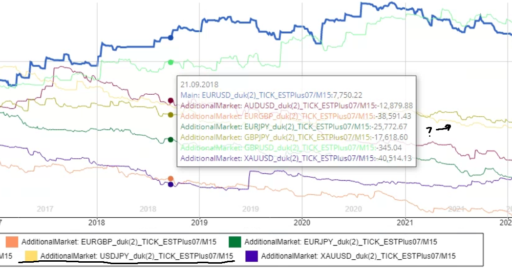
And here we see a middle (USDJPY) symbol being left out. If you are going to not highlight all the symbols then why not pick the nearest 6 to the cursor? Instead, it seems like a random 6 are included in the popup.
E
HH
Votes: +5
© Copyright. All rights reserved. ProjectPanel.com
