[Build 136] Better Show differences in Strategy Config
Please re-write so that only different parts be shown in red

-
Votes +3
-
Project StrategyQuant X
-
Type Bug
-
Status Fixed
-
Priority Normal
History
Alex
11.10.2022 15:18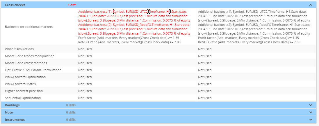
It's now much better, and it is much easier to distinguish differences.
By the way, I have two suggestions:
1. Is it possible to separate ranking and test parameters (using a line e.g.)?
2. Is it possible to show each test parameters in one line? It's hard to find difference.
3. As you see, it seems it contains some bugs. (Red parts does not differ from black part)
Lee Guan Chuan
12.10.2022 12:49
I understand your problem. Unfortunately, I couldn't make it a new line for every parameter. If I do that, some users with many additional markets will have a lengthy page.
However, I have updated it to display it like this. I hope it can help you identify the differences easily. Please look at the attached image.
Yes. That is a bug. I couldn't reproduce it from my side. Can you please send me a strategy with that strategy config?
Thank you.
Alex
12.10.2022 14:21The work you done is great. It really helps us.
Regarding the bug, I do not know where it was created.
I'll send if I could reproduce it.
Thanks
Alex
17.10.2022 09:50
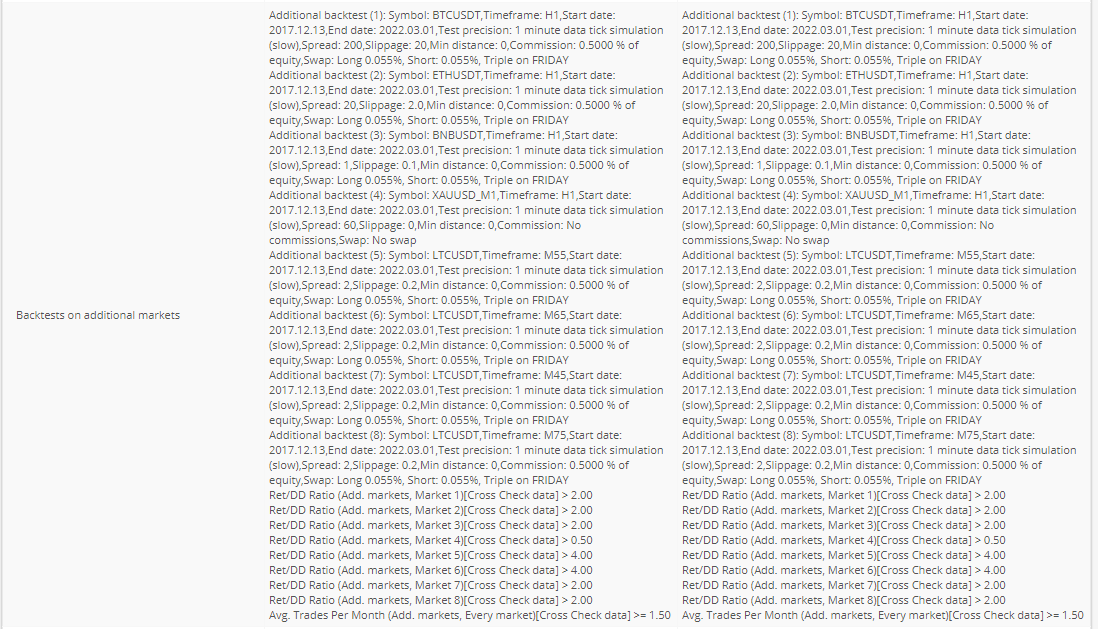
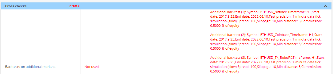
It seems in old version, backtest on additional markets(1) , (2), etc were separated with an empty line, but now as in image-0 they are connected.
Please kindly check it.
Lee Guan Chuan
17.10.2022 10:56Sorry for that. My bad. I have added the gap between the lines.
Thank you.
Alex
29.10.2022 09:59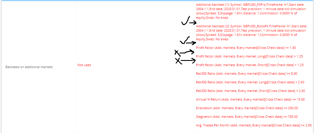
It seems some un necessary line spacing is added in [136Dev6].
the first two is OK, but the latter ones are not required.
Lee Guan Chuan
31.10.2022 06:01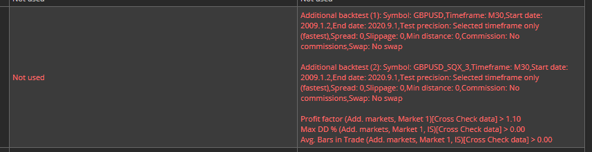
I have updated the gap.
Thank you.
Alex
03.12.2022 04:45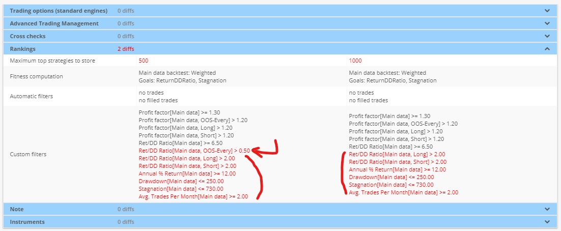
Thanks for solving the issue, we can now find differences much easier.
There is another issue that will be great if can be solved.
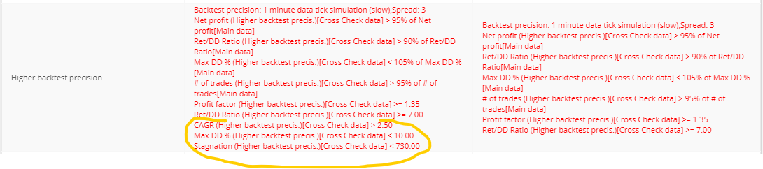
In attached photo, there is only one difference in filters (one shown by arrow is missing in the right side) but much differences shown than exists.
Alex
20.02.2023 04:38Attachment Screenshot 2023-02-20 053614.png added
Attachment Screenshot 2023-02-20 052740.png added

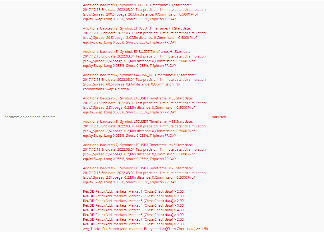
Please note a minor bug when all thing is fine.
there is no space between additional markets.
Alex
18.06.2023 09:48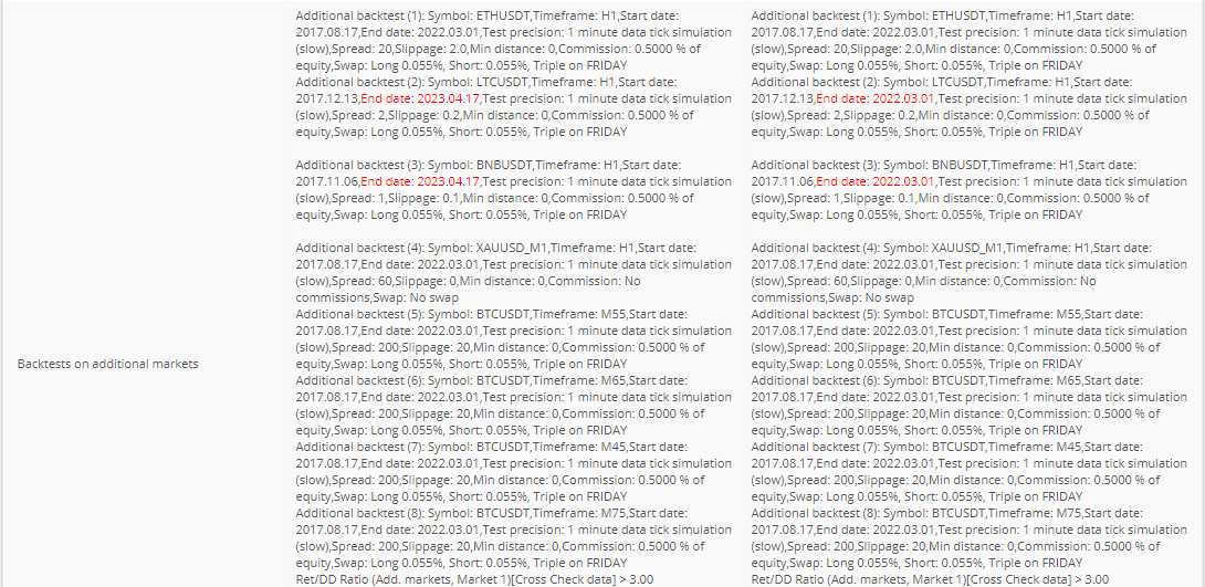
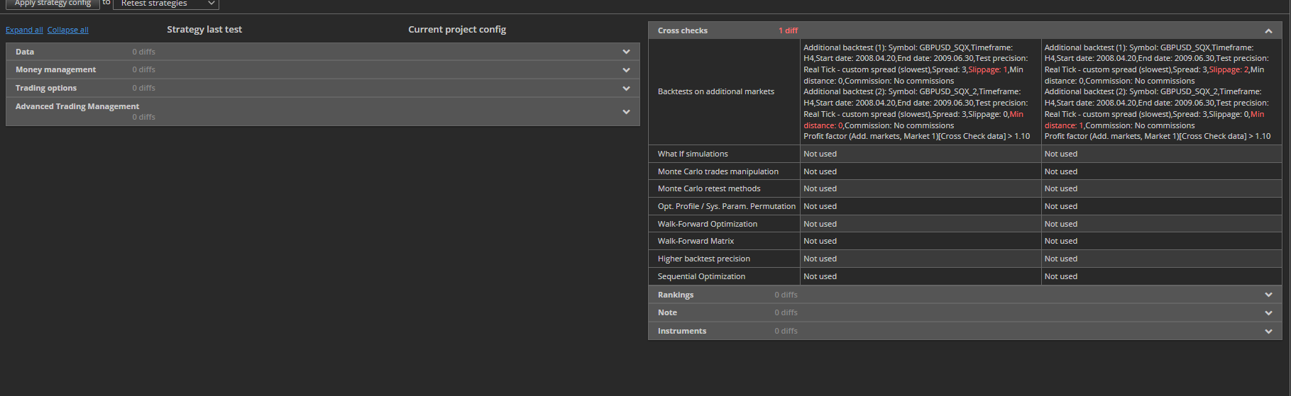
Please look at below screenshot.
At places where we do not have differences, we do not have empty lines which is not good. It s not readable.
© Copyright. All rights reserved. ProjectPanel.com
